
Overview
Bento Grids Portfolio is a web application specifically designed to showcase my work, expertise and experience in the field of software development.
With the application of the bento box style, the user interface looks diverse and neat. In addition, it makes the delivery of information clearer because each section is neatly divided with each gap separating it.
This application uses a WYSIWYG(opens in a new tab) editor to make it easier to create showcase content and has several integrations with external applications developed by myself or others.
Role
Full Stack Web Developer
Core Stack
Let's take a look at the core stack used in this project:
The programming language of the web.
The world's most advanced serverless database.
An open source Firebase alternative.
The platform for frontend developers.
The security and performance company.
The world's most advanced open source relational database.
The most popular web analytics service.
The core stack used in this project includes:
-
Typescript(opens in a new tab)
A superset of JavaScript that compiles to clean JavaScript, providing static typing and modern features.
-
A React framework for web development with server-side rendering and static site generation features.
-
TailwindCSS(opens in a new tab)
A utility-first CSS framework for quickly building responsive designs using pre-defined classes.
-
A modern ORM for working with databases in a type-safe way using TypeScript and JavaScript.
-
PlanetScale(opens in a new tab) (Deprecated Hobby Plan(opens in a new tab) on April 8, 2024), migrated toSupabase(opens in a new tab) and finally migrated to Aiven(opens in a new tab) PostgreSQL.(opens in a new tab)A SQL-based database service
-
Edge Store(opens in a new tab)
A distributed storage solution for modern applications at the edge.
-
Vercel Blob(opens in a new tab) & Deployment(opens in a new tab)
Simple file storage by Vercel and a platform for hosting Next.js applications.
-
A flexible authentication library for Next.js.
-
A framework for building type-safe APIs in TypeScript without needing to define REST API schemas.
-
GSAP (GreenSock Animation Platform) is a JavaScript library used to create smooth, high-performance animations for HTML, SVG, and canvas elements.
-
Three.js(opens in a new tab) + R3F(opens in a new tab) (React Three Fiber)
Three.js is a JavaScript library for creating 3D graphics on the web. It simplifies working with WebGL to build interactive 3D scenes, animations, and visual effects directly in the browser. React Three Fiber (R3F) is a React library that simplifies using Three.js in React apps, allowing 3D elements to be created declaratively with JSX.
Integration
-
Bitlie: https://derikn.com/showcase/bitlie-link-shortener(opens in a new tab)
a RESTful API that works to easily shorten URLs and also includes metrics.

-
Bria AI(opens in a new tab) (Deprecated at May 13, 2024)An AI service for image processing.
-
Google Analytics(opens in a new tab)
A tool by Google for tracking and analyzing website traffic.
-
Microsoft Clarity(opens in a new tab)
A free analytics tool to understand user behavior on websites with heatmaps and session recordings.
-
A platform for application error monitoring, providing error and performance tracking for applications.
Period
January 31, 2024 as the latest branch development
Resources
- Live Application(opens in a new tab)
- Techology Lookup(opens in a new tab)
- Example of Bento Box Design(opens in a new tab) Style
Changes
-
Experimental Version
It's very good actually, but performance issues too because the images are too big, especially if I maintain the image quality. If I lower the image quality, then for large images it looks unattractive. Also, it will require more data to download high-quality images.

-
Simple Version + Showcase Feature
In this version I actually used LottieFiles which is Animation for SVG. But, unfortunately it adds weight to the performance of my application, especially for the mobile version which feels very bad, because the desired animation size is quite heavy.

-
Rigid version
in this version I added the following sections:
- About me
- Have worked for
- Showcase Preview
- Tech Stacks

-
Relaxed version (Current)
In this version I updated the rounded parts to make the elements look softer.
Since I've been using Microsoft Clarity, I've gained more insights into my website, such as heatmaps and visitor interactions. I noticed that some visitors were hovering and clicking on cards, seemingly assuming that there was specific interaction on the Me photo and the 'About Me' card. Since those are the places that get the most attention and visitors interact with those sections, in this version I moved the resume download button from the navigation menu and added the LinkedIn and email icons closer to my profile photo. I also added a 'border beam' to at least have an interesting effect and increased the background blur and improved the quality and lighting of my photos.
And yes, from then on visitors were more interested in clicking on the resume button than clicking on my photo which had no interaction whatsoever. (still envisioning what can and should be added, while that's it)

-
Update for Showcase Preview List Component
In the image below, I actually really like this UI but it's a little out of the bento grid style, because it looks like a regular website section style, and I want to fix it because I want to prioritize quality and clarity over quantity, which also causes the text to be cut off and become difficult to read.

So, I made changes to make it more neat and clear.

-
Add interactive cursor effect
and I finally found a pretty interesting effect, which is a round effect that will change the color based on the difference in color intensity of the intersecting elements. This effect follows the position of the cursor and is only implemented on text because otherwise it would break the appearance and comfort in using the cursor when interacting with the application view (in this case). It uses CSS mix-blend-mode(opens in a new tab).

-
Add Deri Kurniawan 3D Model Character
In this phase, I added the Let's Connect and Help Me Improve sections, both using 3D elements created with React Three Fiber (R3F). Orbit control was enabled for both components with a maximum Azimuth angle of 30° for each. I then added an event so that the 3D model's head would follow the cursor, while the other head would follow the camera position.
I also used the <Html /> component from @react-three/drei to embed React nodes within the 3D environment. This enables the React elements to move dynamically within the scene, creating an immersive effect when the orbit controls are adjusted.
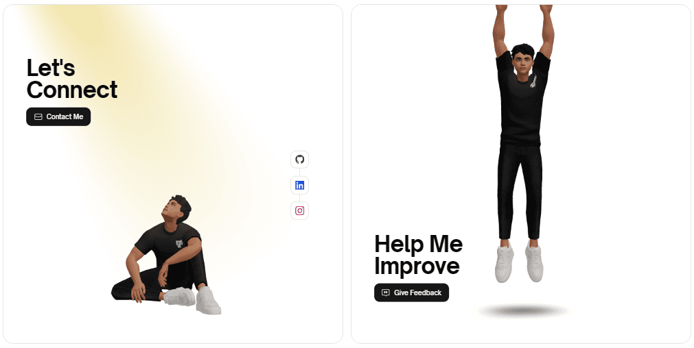
For the 3D model, I created it with ReadyPlayerMe(opens in a new tab) and sourced the animation from Mixamo(opens in a new tab).
Because ReadyPlayerMe only generates .glb files, I had to convert it to .fbx using Blender so I could upload it to Mixamo and customize the model with animations. I also used this tool, https://gltf.pmnd.rs/(opens in a new tab), to generate JSX from the model.
The journey of this project ends here.
