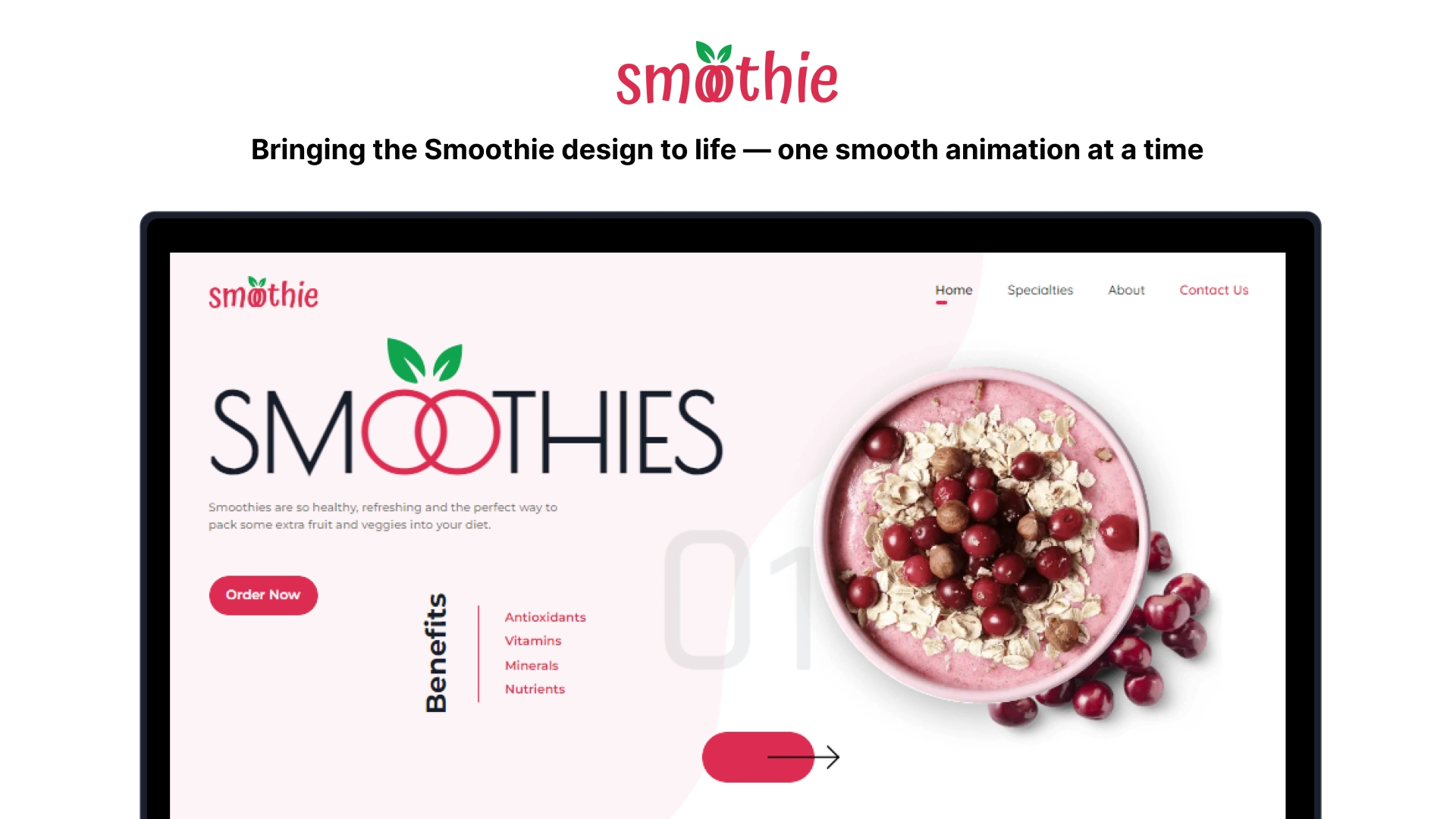
Overview
Smoothie is a visually rich desktop-focused landing page inspired by a community design from Nickelfox Design(opens in a new tab) on Figma Community(opens in a new tab). This project translates the original visual concept into a high-fidelity web application with enhanced motion and interaction design.
While the design is not responsive and targets desktop screens only, it serves as a focused exercise in animation and layout fidelity using modern front-end tooling.
Role
Front-End Web Developer: responsible for implementing the layout, enhancing interaction with custom animations, and refining UI behavior for desktop environments.
Core Stack
Let's take a look at the core stack used in this project:
The core stack used in this project includes:
- TypeScript - Static type checking for better code structure and maintainability.
- React.js - A JavaScript library for building component-driven user interfaces.
- Tailwind CSS - Utility-first CSS framework for efficient styling and layout construction.
- Vite - A fast build tool and development server.
- Framer Motion - Used to create seamless and performant UI animations.
Features
- Desktop-only layout optimized for 1440px and above
- Motion-enhanced user interface using Framer Motion
- Layout and style faithfully based on the Figma design
- Informative screen size notice for unsupported viewports
- Fast load time with modern tooling
Development Period
Initial Commit: June 8, 2024
Live Preview
This project does not support mobile or tablet viewports.
A screen width of 1440px or larger is required to view the application.
Users on smaller devices are shown a message:
If you are on a mobile device, use desktop mode in your browser.
If your screen is already 1440px or larger, but you still see this message, try to click the full screen button in the top-right corner below.